Film Friday - July 11th, 2025. Lomography Lomochrome Metropolis Film Review
Welcome to another of our Film Friday reviews. Today we are taking a look into Lomography’s third entry into their Lomochrome family of experimental films: Metropolis.
Metropolis was first announced via a Kickstarter campaign during the summer of July 2019. There are many things that Lomography has proven to be very adept at but successfully running Kickstarter campaigns to bring their plans to fruition has to be one of their strongest skills. Metropolis’ campaign quickly exceeded its funding goals and the film was hitting camera bags by the end of that year, with widescale market availability following soon after in the beginning of 2020.
Metropolis has two Lomochrome siblings: Purple and Turquoise. While Purple and Turquoise derive most of their effect from swapping colors (greens into purples in the case of Lomochrome Purple and blues into orange with Lomochrome Turquoise) Metropolis instead creates its look by manipulating saturation and contrast.
A fairly representative image of the Metropolis look. Shot on a Pentax 67.
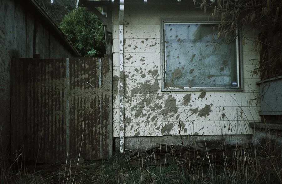
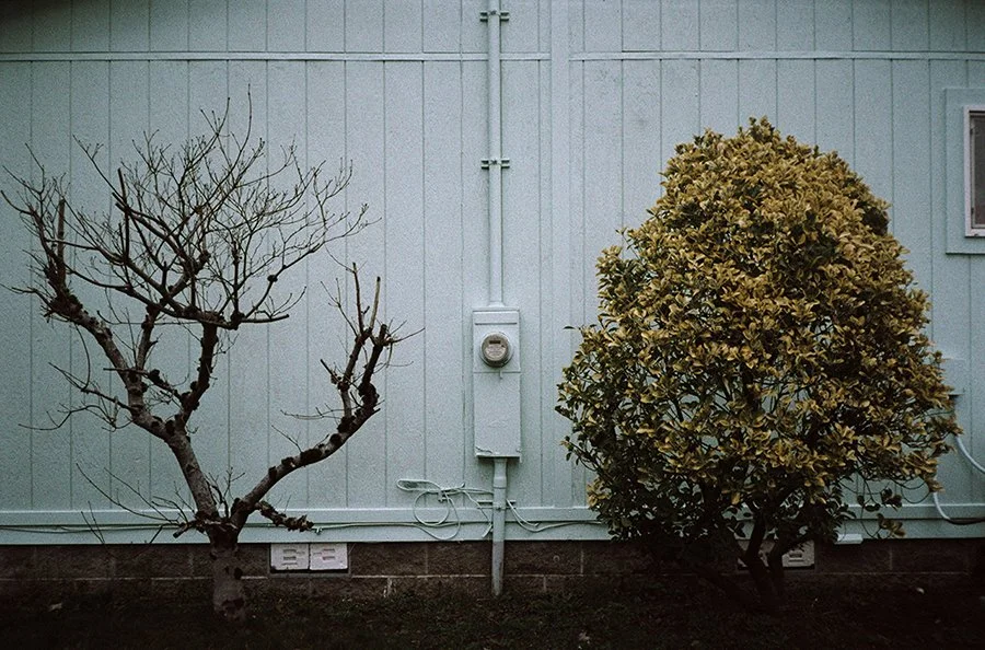
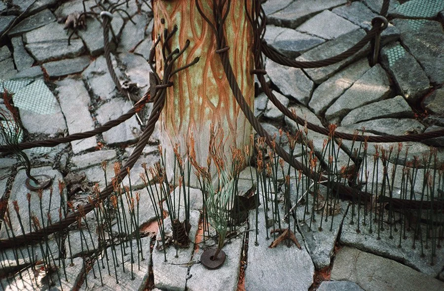
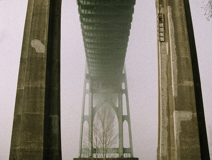
The TLDR on Metropolis is that it offers higher contrast alongside muted colors. This look has been described in a number of ways more colorful than the film itself. You can call it “color film noir” or “grunge” or even “cyberpunkish”. However you choose to label it, Metropolis has muted colors but relatively strong contrast. It tends to have dark shadows or bright highlights, depending on how you expose it. There is a slight overall color cast that can shift from a slight blue to magenta but even when this is corrected for, Metropolis’ colors are still understated and somber. Some colors seem to pop a bit more, such as reds and oranges but even these are toned down a degree and are just more vibrant compared to the rest of Metropolis’ palette.
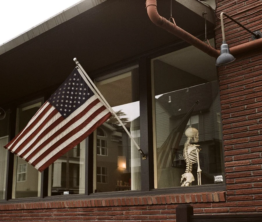
A great example of Metropolis’ more muted color palette as seen in the red of the brick and the red and blue in the flag. Shot on a Pentax 67.
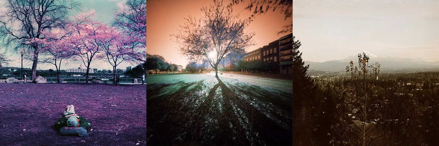
A look at the three Lomochrome films. From left to right - Purple, Turquoise and Metropolis.
A couple really important things to note regarding Lomochrome Metropolis’ contrast and color is that your mileage can really vary. The first factor in this is the film’s variable ISO rating. Lomography touts Metropolis as a variable speed film (just like its other Lomochrome films) and can be exposed anywhere from ISO 100-400. With Purple and Turquoise this adjustment can really have an impact on the color shifts of the final result but we have found that with Metropolis changing film speed has a pretty marginal effect on color but a relatively noticeable effect on contrast. Rating Metropolis at ISO 100 tends to produce a brighter and more faded look. Shadow contrast is greatly lessened and of course your highlights will likely clip out. Meanwhile, rating it at ISO 400 tends to emphasize the gritty and higher contrast nature of this film. At ISO 400 your shadows will be quite dark but your highlight detail will be better preserved while overall contrast goes up. This might point you to the middle-of-the-road ISO 200 and a lot of Lomochrome users tend to start at this ISO and then bracket from there as they gain familiarity with how the film responds to changing exposure.
The other big factor is going to be scanning and post-processing. Because Metropolis does not have the standard orange base characteristic of most color negative films the auto corrections in film scanners will respond differently to this film. Tie in any adjustments made by the human operator and you have a recipe for mixed results. This is a big reason why you will see Metropolis showing off so many different color casts when viewing samples online. Exactly which settings are applied at the time of scanning, as well as which corrective measures are done in post-processing will noticeably change the final underlying color shifts of this film. Keep this in mind if you do online research and as you experiment with your own rolls of film.
This Metropolis image is more or less straight out of the scanner. It has a moderate yellow color cast to it.
This second version is the result of a quick auto color correction done in Photoshop. This correction could just as easily have been applied during scanning, just like the original yellow cast could just as readily been a product of the scanner’s auto corrections. For what it is worth, we like the bottom “corrected” version but taste is subjective.
Whenever we work with Lomochrome films we always assume some amount of color correction is going to be necessary post-scanning. This is as true of Purple and Turquoise as it is of Metropolis. Film scanners just are not calibrated to easily recognize this film and know what to do with it. To get the most out of your Lomochrome Metropolis it is a good idea to expect some post-scanning polishing will be required.
So you have the heightened contrast and you have the muted colors of Metropolis now shown to you. The third quality of this film that is likely to stand out is its intense grain. None of the Lomochrome films will ever be called “fine grain” and Metropolis is not changing that trend one bit. This is a super grainy, very gritty film. This is not your film for smoothness or sharpness. This is your film for tooth and texture. This grain also scales based on how you expose this film. If you want to suppress the visible grain a bit, try rating it at lower ISOs (or tend toward overexposure). If you want to emphasize the grain then shoot Metropolis at ISO 400.
This 35mm Metropolis image clearly shows the film’s grain. This exposure was made at ISO 400.
Meanwhile this image was made on a Pentax 67 medium format camera. Even in 120 format the grain of the film is quite visible.
So where does Metropolis film shine the brightest? That is a really good question. Whenever a film has a strong effect it walks a thin line between gimmick and creatively executed. Personally, we feel that given this film’s contrast, muted colors and gritty appearance it lends itself quite well to urban scenes, especially those of an industrial or futuristic nature. Some of the most interesting work we have seen from Metropolis has come from photographers working with this film in nighttime cityscapes, in gritty, industrial areas or otherwise. We have seen some interesting studio portraiture done on Metropolis but we have yet to really seen a good Metropolis landscape image that speaks to us.
Let that inspire you though rather than deter you. Just because we didn’t list your intended use for Metropolis in the previous paragraph doesn’t mean you shouldn’t take it out and try it. In fact, one of the underlying principles to Lomochrome films is experimentation. It is about going out and trying something different and seeing what happens. One of subtle strengths to Metropolis might be that it is different but not alien. It is not as sharp a curveball as Lomochrome Purple or Turqouise, or redscale or even cross-process (though it is fairly similar to this last technique). It is alternative but accessible. It is an easy film to experiment with and get results that are both different but not completely off the wall. There are still corners to this film we haven’t even explored - things like push processing, long exposures or developing it in E-6 chemistry. So hopefully this review gives you a foundation to start from and some inspiration in terms of directions to go. Should you try some? The answer to that question, regardless of the film, is always yes. An unexposed roll of film is always a series of opportunities waiting to happen.
Lomochrome Metropolis is currently available in 35mm, 120 and even 110.
We have almost every film stock available on the market. Check it out!
If you need an excellent lab for meticulous film developing, topnotch optical prints, traditional darkroom printing and superb film scanning, we’re your lab!
Also, sign up for our weekly newsletter The Loupe and keep your eyes peeled on our social media feeds every Friday when we feature a different film and also offer it at a one day discount of 15% off!
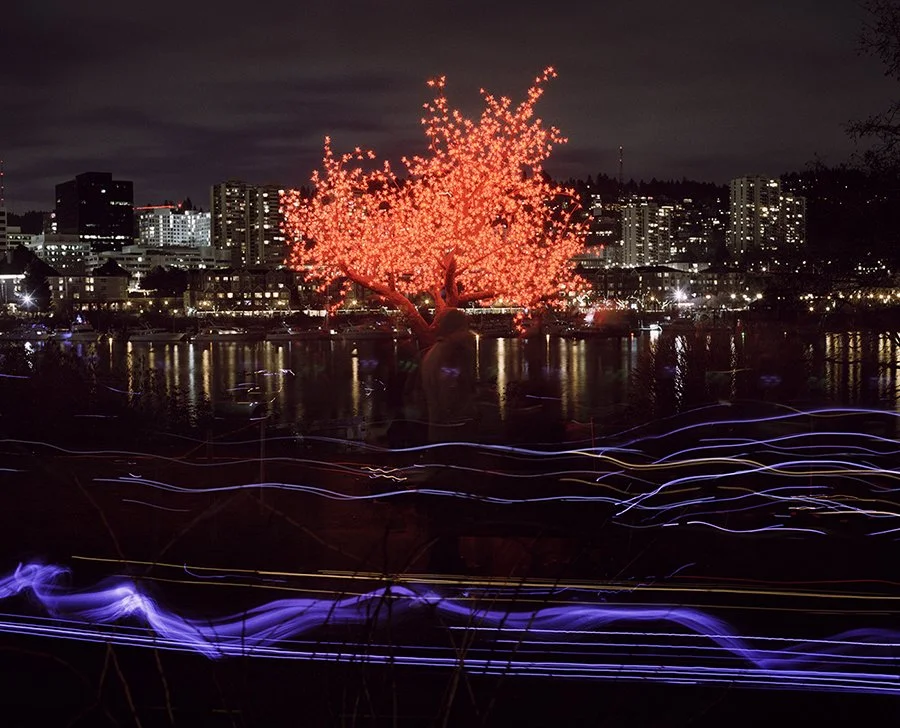
Some of our favorite Metropolis images have come from using this film at night in urban scenes, especially when artificial lighting is involved. It can heighten the sense of futuristic, sci-fi noir already present in such places.
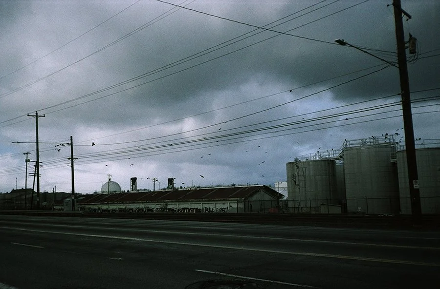
Meanwhile the drab, muted colors can produce a somber mood in other situations, or a slightly dark sense of mystery.
This is a sample image we made with a Minolta 110 camera loaded with a cartridge of Metropolis.


