Adventures in Color Film
Written by Mary Thomas
When I started working at Blue Moon Camera, I became much more concerned with the film stocks that I was using. Whereas before I would pick up any old roll at a grocery store and shoot, at BMC I was surrounded by film stocks of all sorts. I found myself intrigued by all of the different options on the shelf and extremely curious as to what their differences were. So began my Adventures in Color Film.
Leaning towards portrait photography, I naturally started with Kodak Portra (160 and 400). And I loved it.
The greens, the yellows, the fine grain – it was flawless. But of course I wouldn’t use Portra forever. There were many more films on the shelf, and they were calling my name.
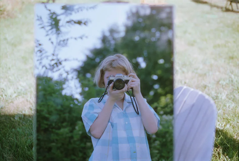
Next up, Kodak Ektar 100. I was hesitant to try it at first because Ektar is known for its vibrant reds, which don’t necessarily look great when the reds are the undertones of someone’s skin. Nonetheless, I went for it, and I’m glad I did. Ektar yields fantastic colors and has a lovely fine grain structure. I really haven’t found anything more vibrant.
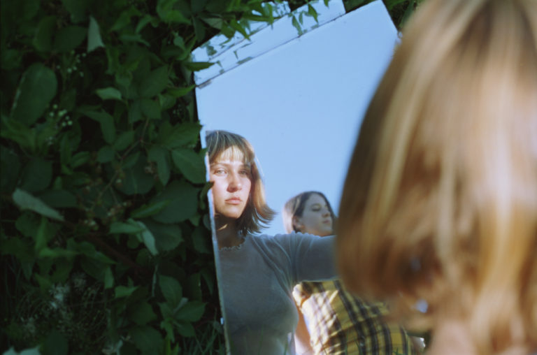
After trying Ektar, my coworker Jim convinced me to pick up a few rolls of his personal favorite, Fuji PRO 400H. I was sufficiently impressed. It’s sweet, soft, and quite true to the colors I see when I’m making the photographs. In the future I plan to use reds and pinks more, and I think this is the film stock I’ll choose when that time comes; all the vibrance of Ektar without the skin tone dilemma.
It took me a while to try out Agfa Vista (200 and 400), as it is one of our least expensive options. I quickly realized how silly I’d been avoiding a film for its low price – judging a book by its cover. What a snob. Anyway, it was good. Very good. The colors are surprisingly striking for a consumer film; they are richer and more vibrant than I had expected. The grain structure is more visible than I typically prefer, but the combination of the grain and the striking colors gives it a unique look that I definitely appreciate.
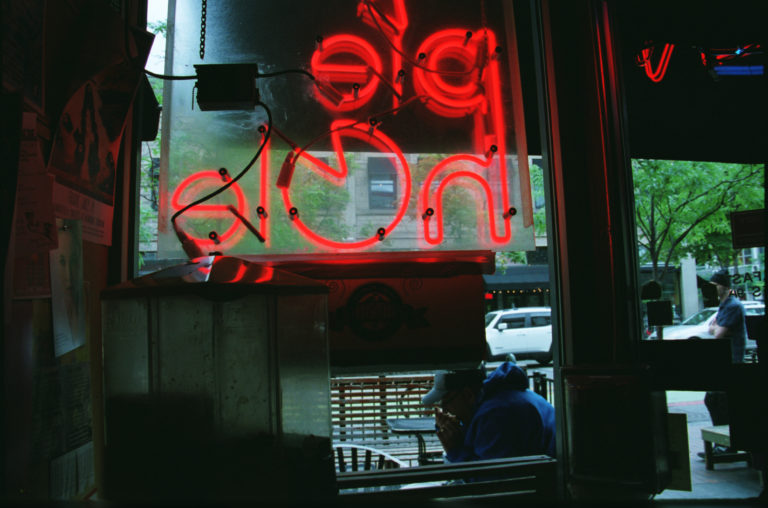
Moving along to faster speeds, next up was Cinestill 800T, an incredibly unique stock that was converted from motion picture film. You can see the tungsten-balanced colors (the “T” of 800T), giving images a bit of a cool blue tint. I’ve gone through a few rolls and my results have varied. Sometimes I will get a roll back that I really love and sometimes I’m unimpressed. Although, that could easily be user “error” – 800 speed color film requires some level of testing and re-testing in order to produce photographs that look like you want them to. Overall, a great addition to the collection; some of my favorite photographs have been on Cinestill 800T.
After Cinestill, I had to try the same speed in the brand of film that originally made me love color film: Kodak Portra 800. This is a lovely high-speed color film that I think I prefer to Cinestill 800T in grain structure as well as tone. It feels smoother and the colors emulate the warmth that I tend to lean toward in many of my photographs.
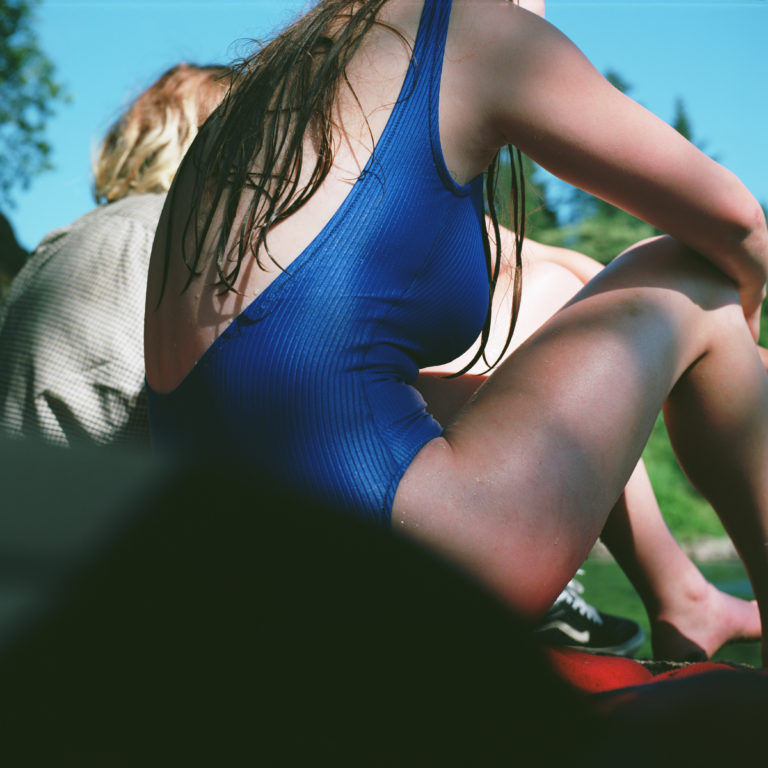
Lastly, my very favorite color film at the moment, Cinestill 50D, the younger brother of sorts to the 800T. It might be the summer weather that made me so fond of this low ISO stock, but I just can’t get enough of the glow that Cinestill produces as a result of the removal of the anti-halation remjet layer from motion picture film. This film is perfect for the days when harsh shadows and intense sunlight would normally spoil portraits; the low speed has a way of balancing contrasting light that, paired with the film’s subtle saturation of colors, makes for an incredibly smooth photograph. Whereas the 800T has a blueish tint, I found that the 50D leans toward warmer tones in general.
Although black and white film is near and dear to my heart, exploring these color films has been incredibly beneficial to me in finding my voice as a photographer. The type of film one loads into their camera plays a heavy hand in what the resulting photographs will look like, so it’s nice to feel like I have some control over that hand. No one type of film works with every single photo I want to create, but scrolling through my work with each film stock helps me to align the vision I have in my mind with the one that will come out of the darkroom.
I have yet to get through the entirety of our stock of color films, but I’m close.
Keep up with my photographic journey on Instagram @marylthomas


